Infographics: A Guide
Infographics have become an indispensable communication tool for businesses. Crafting one requires following a set of specific steps.

Gathering data to include in the infographic
What’s the purpose of an infographic?
An infographic is a content format specifically designed to convey complex information in a simple and accessible manner. It allows for a subject to be summarised, focusing on the key data to remember, providing context for challenging information, and being easily memorable for online users. That’s why infographics are suitable for all sectors of business and cater to marketers, salespeople, consultants, institutions, associations, educators, and more. However, its effectiveness greatly relies on the message it delivers and the information it incorporates. To create an infographic, you must first have something to say. Or, to be more precise, you need data to work with.


What kind of data is used? And to address what kind of questions?
An infographic project should always address a set of questions. Typically, an infographic revolves around a primary issue that forms its general subject, alongside two or three secondary issues that the content will explore.
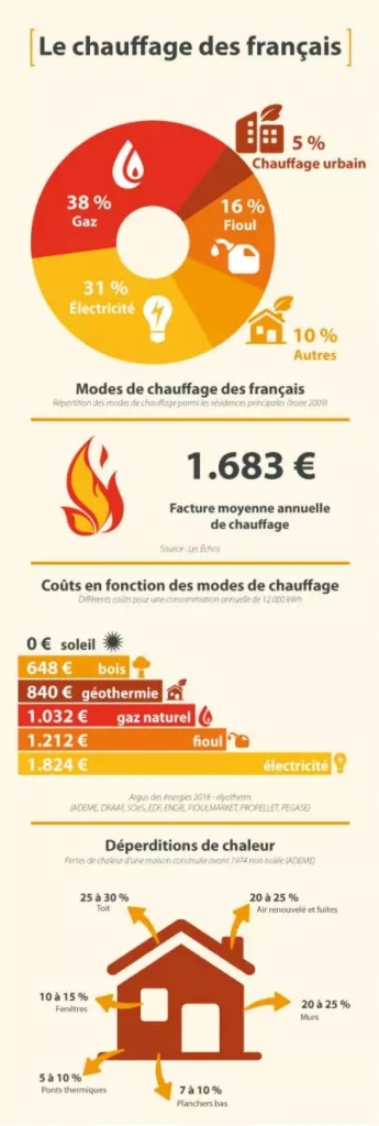
(source: Travaux à part)
In this example, the main issue revolves around heating practices among the French. The secondary aspects centre on factual elements, such as heating methods, average energy costs, and areas of heat loss in a house. These sub-issues are supported by statistical and numerical data that provide answers to the underlying questions. It is through this data that the essential message is conveyed.
How to collect data for an infographic
If you have your own data, that’s great: you just need to structure and incorporate it. If not, you’ll need to gather figures from external sources (as in the example above). The first step in searching for data is to use Google. The search engine is more sophisticated than it may initially seem, as you can refine your search by using various techniques: placing the desired phrase within quotation marks to search for specific terms together, adding the word “data” or a particular format (such as “pdf” or “xls”) to the query, instructing Google to focus on a specific site (e.g., “site:example.com”), and more. To collect data from the web, you can also consult the following resources:
-
Google Public Data
The “public data” section of Google provides structured repositories that rely on official data providers such as Eurostat or the World Bank.
-
Data.gouv.fr
The “open platform for French public data” is a valuable source of numbers and statistics across various areas (e.g., food, health, education).
-
Statista.com
This comprehensive (paid) tool allows you to access an incredible wealth of aggregated information covering most industries.
-
Un Data
Managed by the United Nations department dedicated to statistics, this platform brings together around thirty databases on a wide range of subjects.
-
Insee
The French National Institute of Statistics and Economic Studies is a rich source of publicly available data and official studies, freely accessible.
-
Eurostat
A platform that brings together statistics collected from member countries of the European Union, in connection with community policies.
Good to know
An infographic should be relevant, accurate, and up-to-date. It’s crucial to go back to the source to verify the accuracy of a statistic, ensure the quality (and objectivity) of the sources consulted, and guarantee the accuracy of the information discovered.
-
55 %
of internet users
spend less than 15 seconds on web content. -
81 %
of internet users
simply browse through online content. -
90 %
of the information
transmitted to the brain is visual.
Choosing a suitable infographic template for the data
What’s the best infographic format to choose?
Once you have the data in your possession, it’s time to select an infographic template for the most effective presentation. Depending on the format, your content will have varying elements like titles, subtitles, text blocks, and more. It’s important to choose the right template from the start, one that suits the content, addresses the issues, and highlights the information you want to showcase. To do this, you first need to determine what you intend to achieve with this infographic. Do you want to inform your audience? Compare information? Illustrate trends or patterns? Describe an organised process? Depict complex relationships between components? Provide a geographical overview?
What are the most common infographic formats?
Let’s explore the different infographic templates available.
Statistical infographic
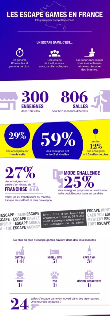
This infographic focuses on presenting numerical and statistical data. It visually emphasises the data with larger fonts and colours, uses various visual forms such as icons, diagrams, and charts, and incorporates images or illustrations. The text is kept concise, and limited to essential details.
Informative infographic
This template is ideal for presenting various aspects of a topic. It stands out with its structured approach, clear sections, descriptive subheadings to provide context, and user-friendly design that allows viewers to quickly find relevant information. It offers more comprehensive text blocks to provide in-depth information.
Chronological infographic
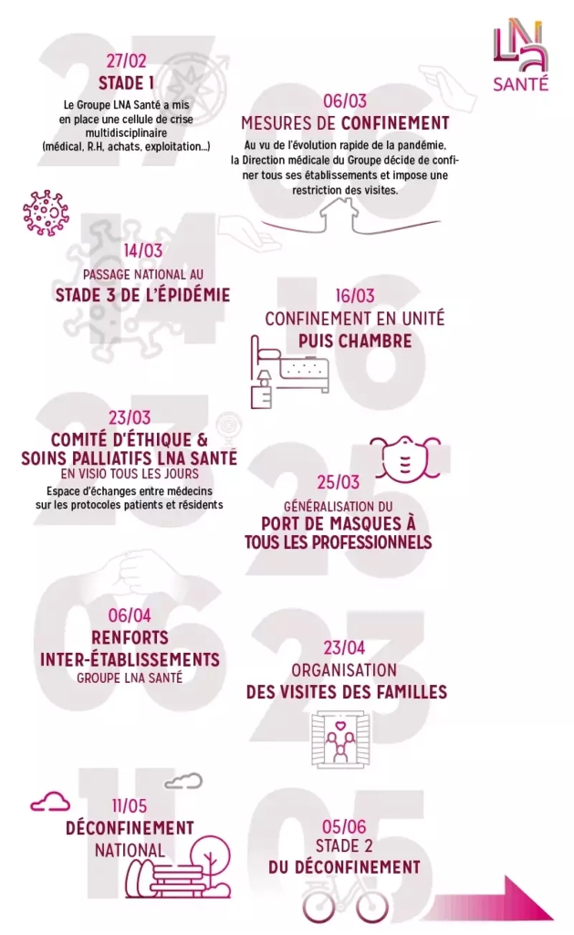
The chronological infographic model emphasises the progression, trends, or historical aspects of a specific subject. It effectively represents a time period by highlighting key dates, providing visual cues for easy navigation, and incorporating text blocks to provide context.
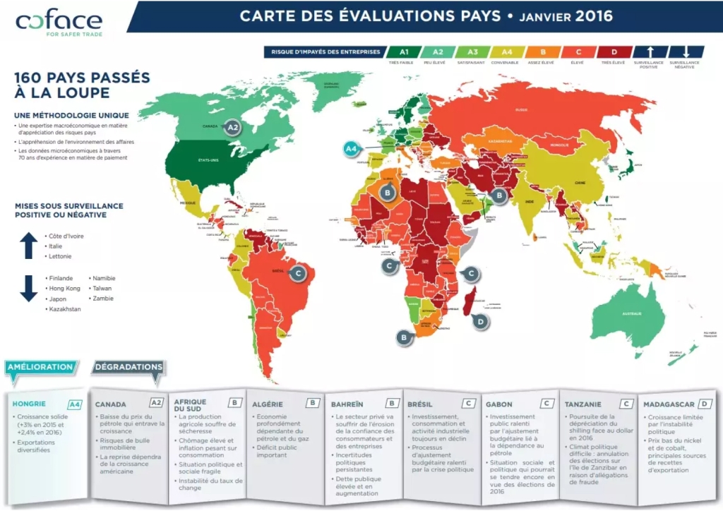
Geographical infographic
This format is particularly suitable for presenting geographical or demographic data for various purposes. It can be used to indicate locations (e.g., different brand outlets), provide informative maps accompanied by statistical data, compare regions or countries, and more.
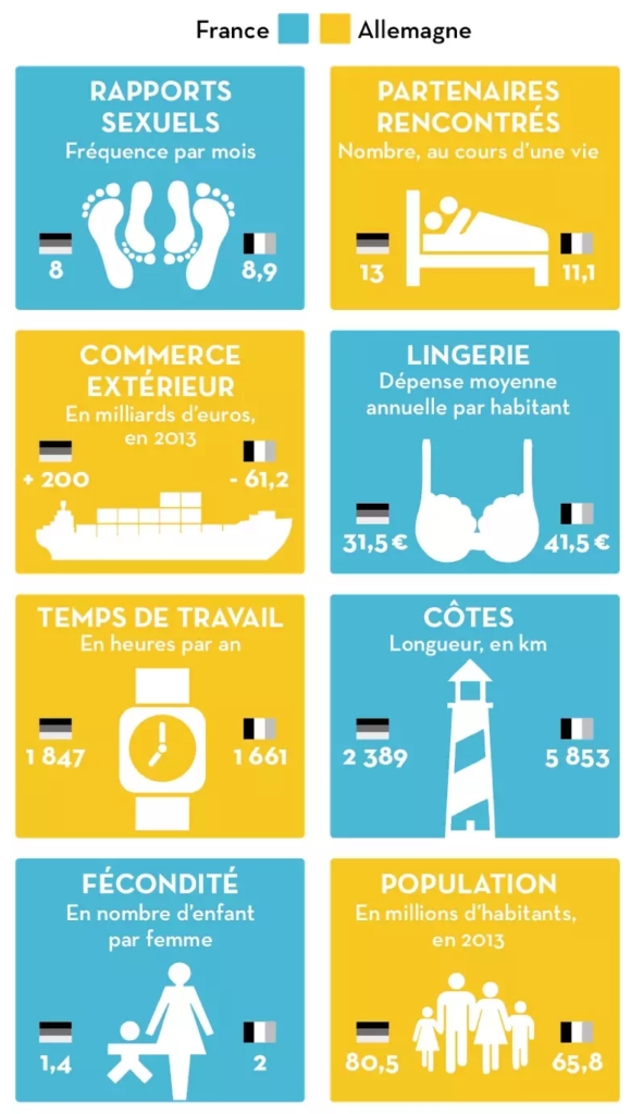
Comparative infographic
As the name suggests, the comparative infographic juxtaposes two elements for the purposes of comparison and assisting viewers in decision-making. It employs a visually appealing and easily understandable layout, incorporating icons, images, colours, and fonts to enhance visual impact. The information presented is clear and memorable.
(source: Libération)
Process infographic
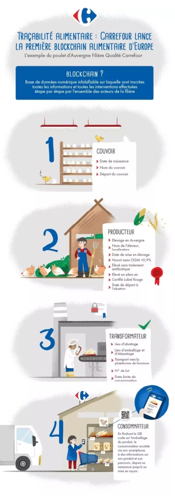
The process infographic model aims to visually represent the steps involved in a particular process. It features a clear and straightforward layout, using numbered subtitles, recognisable icons or visuals, and directional markers such as lines or arrows to guide viewers through each step.
(source: attestis.com)
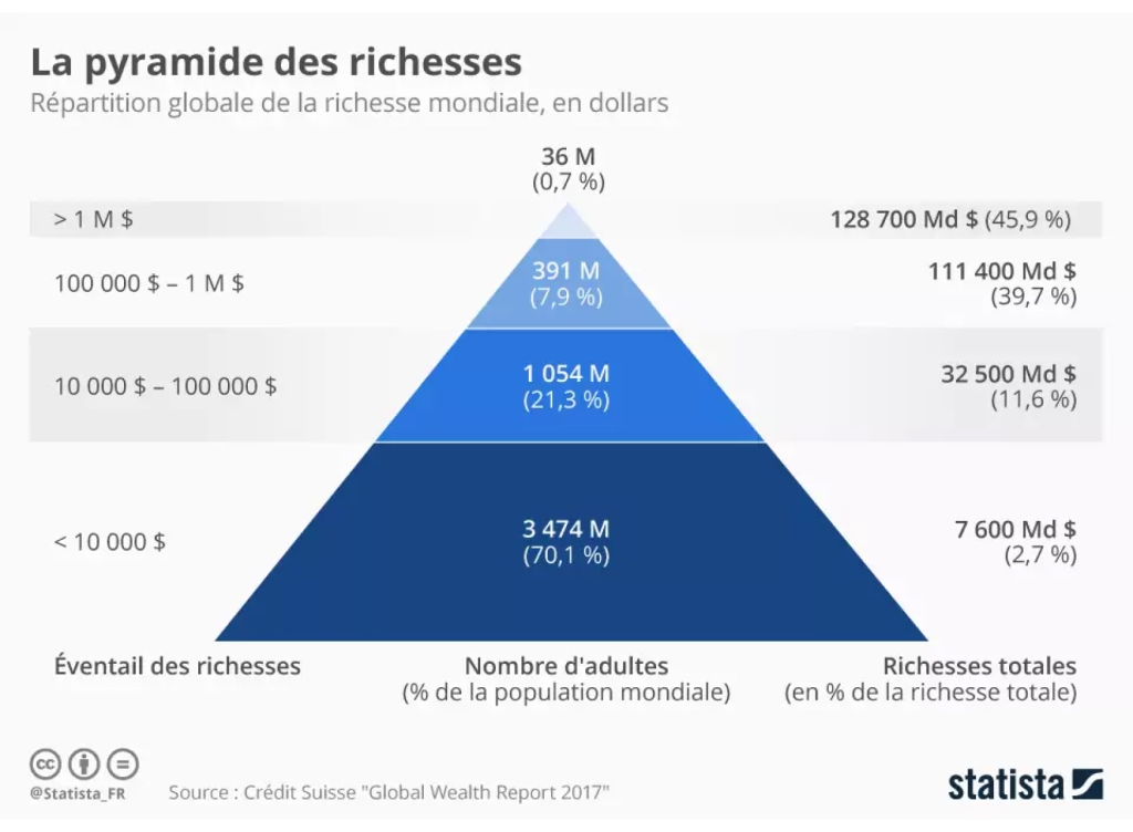
Hierarchical infographic
To organise data based on their importance, the hierarchical infographic format is highly effective. It is often presented in the form of a pyramid or organisational chart. This model employs an explicit visual layout that ensures immediate understanding and retention by viewers.
Listing infographic
This template capitalises on two formats that are popular among internet users: infographics and standard lists. It combines the visual appeal of infographics with the structured format of a list. Icons, images, colours, and typography are used to enhance the visual elements of the list. The listing format offers flexibility, allowing for non-hierarchical or non-vertical arrangements.
Arranging the elements in your infographic
Organising elements to convey the right message

Once you’ve selected an infographic template, you can arrange and position the different elements according to the message you want to convey and the target audience’s profile. It’s important to understand that the brain relies on the structure of visual information it perceives and compares it with personal experiences to interpret things. For instance, individuals accustomed to reading from left to right will find content organised in that direction more immediately comprehensible. Therefore, it’s crucial to carefully consider the layout of your infographic to ensure cohesive content and optimal understanding by the reader.

The key principles for arranging elements in the infographic

-
STEP 1
Placing the data
Opt for a logical and intuitive structure, including presenting the main issue in the title and secondary issues in subtitles, organising data into sections, and respecting the direction of reading—or providing a clear path to follow for discovering elements in the correct order. You can also leverage structural templates like a symmetrical grid or one or more central columns.
-
STEP 2
Separating the data
Visually separate the data to draw the reader’s attention to specific sections of your choice. Use lines, borders, or geometric shapes to frame elements that require emphasis. Lines are particularly effective for connecting data and facilitating the reader’s comprehension of the infographic.
-
STEP 3
Writing the text
Whether they’re used for providing context or explanations, the text that accompanies your infographic should be kept concise and to the point. Remember that this type of content is primarily a visual summary, and an excessive amount of text can hinder memorability. The text blocks should offer supplementary information without overwhelming the reader.
-
STEP 4
Think about empty spaces
Structure your elements in a visually pleasing arrangement, ensuring they have sufficient breathing space to allow the reader to navigate smoothly between each section. Keep in mind that empty spaces are just as important as visuals and text blocks, as they guide the reader’s attention and enhance comprehension of the content.
-
65 %
of brands
use infographics in their content strategy. -
69 %
of marketers
claim that visual content is essential to their strategy. -
12 %
– the average increase
in traffic generated by infographics.
Customising the infographic for maximum impact
An infographic is (also) a unique communication tool
You now have a “raw” infographic with its elements arranged and text written. It’s time to customise it, ensuring it stands out from the crowd, especially from your direct competitors. This serves a dual purpose: attracting more attention to your infographic, enticing internet users to engage with it, and aligning it with your brand’s visual identity. It’s important to remember that an infographic is, above all, a communication tool and should be immediately recognisable as an extension of your brand.


Customising your infographic: step-by-step

-
Selecting the fonts
Fonts have a greater impact than you might think. They influence the visual appeal of the content and help guide the reader’s eye across different elements. You should therefore try to use distinct fonts and/or sizes to establish a hierarchy within the page. Opt for a stylised and larger font for the main title, a more understated and medium-sized font for subtitles, and a neutral and smaller font for text blocks.
-
Choosing the colours
Colours play a significant role in making an infographic unique. They connect with your brand’s visual identity and can be a powerful communication tool, evoking specific emotions and directing viewers’ attention to important data. Just like the separation elements (as discussed in Part 3), colours can be used to group information, highlight specific data (using contrasting shades), add depth and texture (for example, through a coloured background and/or decorative patterns), and more.
-
Selecting the visuals
Visuals bring life to the infographic, providing additional information (sometimes replacing text) and guiding viewers through different elements. Visuals can take various forms, such as icons, images, illustrations, graphs, and more. The goal is to enhance data presentation and convey information in a simple and quick manner, so choose visuals that effectively communicate your message.
Our Commitment
-
Expertise
Since 2010, we have worked with over 2000 clients across 90 countries.
-
Passion
We are a team of passionate, industry-focused individuals who are committed to your success.
-
Performance
We’re committed to implementing a data-driven strategy, making a real impact on your bottom line by providing avenues for growth.
Any questions?
An infographic refers to a type of content used as a communication tool to convey information to the public. It is primarily a visual format that highlights numerical and statistical data, illustrated using icons, drawings, images, and graphs. Infographics are designed to provide maximum information in a simplified and easily accessible manner.
Infographics allow you to condense a wealth of data into a simplified and easily understandable form that appeals to everyone. They are an excellent way to communicate a clear message to your audience, ensuring a proper understanding of the information and improving retention – as visual formats are the easiest to remember. Infographics also serve as a powerful tool for enhancing brand awareness.
To create an impactful infographic, start by developing the message you want to convey and gather relevant data, either internally or from reliable sources. Then, choose the appropriate format based on the subject matter and the available data. Finally, arrange the elements coherently and customise the infographic to give it a distinctive and unique style.


