Designing a product, an application, or a website isn’t just a matter of content. It is, above all, a matter of use. The interaction design must be seamless and intuitive, it should be relevant and pleasant to navigate, and the general impression should be a positive one. This streamlined use of the product is also known as user experience (UX). The design methodology which answers this requirement is called UX Design. This field combines ergonomics with technique and emotion. The intent is to enhance the product’s usability.
Yet, for many, the notion of “user experience design” remains ambiguous. What is UX Design, exactly? And how does it benefit applications, within the scope of a website in particular? Here’s what you need to know.
What Is UX Design?
When answering the question “What is UX Design?”, there are two distinct elements to address: the design part, which pertains to the interface, and the UX part, which refers to the user experience. In essence, UX Design has to do with designing a product or service (mobile application, website, or other) from a user-centric perspective. In other words, it considers the users’ needs and requirements to ensure an optimal experience.
The expression was coined by Donald Norman, co-founder of the Nielsen Norman Group, and figurehead of the pro-end user crusade that so profoundly marked the eighties. In 1988, he wrote The Design of Everyday Things, which laid the foundations for user-centered design and is still touted as the genuine UX bible to this day.
Understanding UX Design
UX Design is a subject area whose aim is to activate the (technical, graphic, commercial, strategic) levers necessary to come up with a user-friendly interface and to offer a high-quality user experience. Behind this complex methodology sits a very simple, yet tremendously relevant idea: Even the best content in the world will fail if it’s poorly designed from the user’s perspective. In essence, it’s all about shaping products or applications that improve the user’s experience and, ultimately, their very life.
To this end, a UX Designer must consider not only the objective components of a product or service (its functionalities, reliability, uses), but also more subjective aspects, namely how the users feel about the experience (convenience, importance, pleasure) as well as the emotions it raises. The well-known “UX pyramid” offers a clear visual representation of this hierarchy:
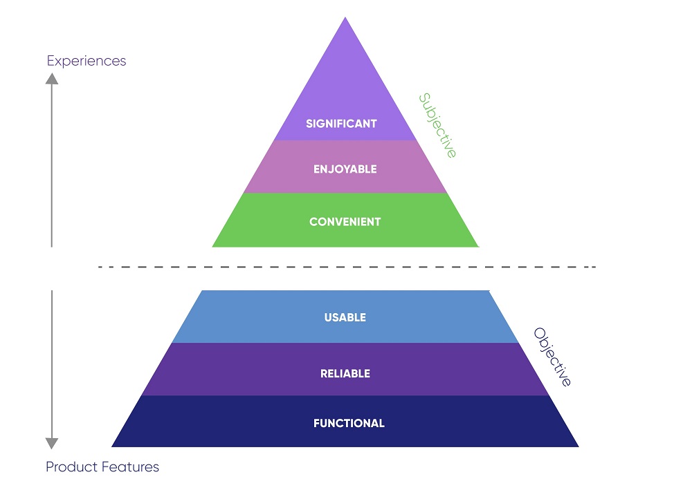
(Source: Technexia)
That is why UX Design, as a methodology, is so complex. Because it’s multidisciplinary. Unlike the name suggests, the subject area doesn’t exclusively focus on interface design, but intersects with such fields as research and development, production, technology, interactivity, psychology, sociology, and commercial strategy. User Experience Design encompasses anything that makes up the value chain of a product or service at one point or another, so as to create ideal technical, practical, and emotional interactions. In that sense, UX Design contains…
- The why (motivation, values, perception)
- The what (use and functionalities)
- And the how (usability, aesthetics)
Which leads us to dispel an all-too-common misconception: Confusing UX Design with UI Design.
UX Design vs. UI Design
The confusion does make sense. Not only are the two expressions practically homonymous, but many tend to believe that interface and user experience are one and the same. This is a common misunderstanding. Although they are related, each field has its own goals. User Interface Design focuses on what the user sees when faced with the product or service, rather than on how they can use it. The following infographic makes the difference more explicit:
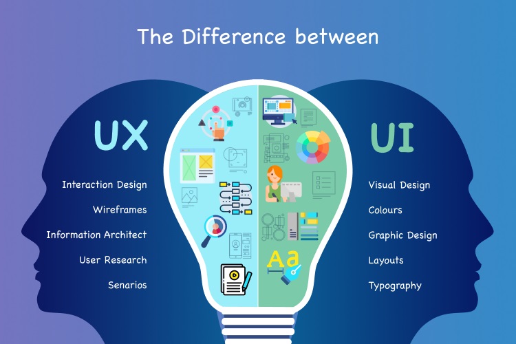
(Source: Celest Technologies)
One may therefore consider UI Design to be a component of UX Design, as the interface is a lever that creates interactions and prompts visual emotions. Yet, the user experience must come before the interface, so that the latter can be adapted based on the users’ needs instead of trying to make an existing interface match the customers’ requirements.
This difference between UX and UI is easy to illustrate through the following example of the ketchup bottle.
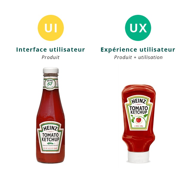
It’s a simple principle. The bottle on the left is an example of a quality interface, designed to look beautiful without taking practical use into account. But because it requires the user to turn it upside down and slap it on the bottom to get the product out (even if it means getting ketchup everywhere), it happens to be rather inconvenient. The bottle on the right, on the other hand, is used as an example of a positive user experience because it is designed to be easier to handle and use. Which is true, but there remains a slight confusion. When it comes to their appearance, both bottles are examples of UI, since they each offer a specific interface. The difference is that the second bottle sports an interface that derives from an in-depth reflection on a UX Design level by answering the initial question: How to get the product out without spilling?
All in all, one could say that UI Design is what you see of a product or service, whereas UX Design covers the entire process that has led to the optimal interface.
How to Create the Optimal User Experience?
UX Design applies to every product or service. However, for the purposes of the present article, we’re going to focus on its digital applications and, more specifically, on the creation of a website according to the principles of user-centered design.
While defining a “good” user experience is not easy when it comes to a website, showing the concrete consequences a “bad” UX could have on how a user interacts with the website, on the other hand, is relatively simple.
Let’s take an e-commerce platform as an example. The prospect wishes to purchase a pair of running shoes. In the absence of a search engine, user research takes over, where the user needs to locate the right category all by themselves. Once on the results page, they realize that it’s impossible to filter the products, which means they are stuck having to scroll down and view every single item until they find the one they are looking for. Having spotted the perfect pair of sneakers, they add it to the basket and proceed with creating an account – which takes 20 minutes because of the multiple fields they need to fill in. And when this process is finally complete and the customer is ready to complete the payment… the shoes have vanished from the basket!
Anyone would agree that this is a negative user experience and that this string of setbacks comes straight down do poor UX Design. Let’s see how it could be fixed.
The UX Design Process
When creating a website, UX Designers need to anticipate how visitors will use it and to visualize every problem statement: path to purchase, actions required to go from point A to point B, user-friendliness, the ability to click elements on certain pages… The problem statements then need to be converted into concrete functionalities and a suitable interface.
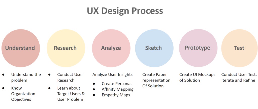
The UX Design process traditionally follows a series of 6 steps:
(Source: LinkedIn)
- Understanding the problem(s) that the website is aiming to solve.
- Seeking the optimal user experience, which involves thinking like end users and grasping why they do what they do.
- Analysing the information pertaining to the problem(s) and reflecting on possible solutions.
- Designing the information architecture and the interface, both of which should address the problem(s) being raised to adapt to the behaviour of the users.
- Creating a website prototype.
- Usability testing with the aim to fix any issues identified prior to launching the site.
Optimization Factors in the UX Design of a Website
While every website is different – which is why applying the process described above is useful – certain factors do stand out when it comes to optimizing UX Design to offer the best user experience possible. Here are the main elements to consider:
Usability
A website must be designed for human interaction, with the user in mind. This applies to the website’s visual design (graphics, colours, fonts, animations, images…) as well as to its ergonomics, accessibility, and its ability to provide a satisfying experience.
The hierarchy applied to the various elements within the page is crucial in and of itself. It needs to help the users understand, at a glance, which information is essential and what is optional. To this end, one can leverage the placement of the elements, or the fonts and colours of the text, for example. There exist design standards – such as placing the menu at the top or on the left side of the page, making the brand logo clickable with a link to the home page, etc. – which it is best not to stray from, lest you lose the users who expected to find certain functionalities.
When it comes to UX Design, usability also promotes efficiency. The users should be able to find what they are looking for without more effort than is strictly necessary. One should keep in mind that browsing is not the end game but a means for the users to reach their goal – which is finding a piece of information or performing an action. Nobody spends hours on a website for the sole purpose of going from one page to the next. UX Design encompasses the notion of efficiency and gives it substance through simple tools, such as…
- An always-accessible menu (to be able to click on it at any time)
- The presence of an internal search engine
- The ability to track the user’s navigation path (through a “breadcrumb trail”)
- The number of steps remaining before an action can be completed (for example, when making a purchase, how many pages the user needs to get through before they can validate the operation)
- The coherent categorization of the website’s contents
- The ease with which processes can be completed (creating an account, purchasing a product, receiving a document…)
- The three-click rule (making sure the user doesn’t need to click more than three times on average to get to any page on the site).
The role of a UX designer is to keep things simple and to the point. Rather than overloading the pages by adding features, animations, and pop-ups, it is best to think about making the navigation flexible, the contents easy to access, and the information each page contains straightforward to comprehend.
Technical Performance
The technical quality of a website is one of the main factors to consider in UX Design because of its considerable impact on the user experience. The matter of the web pages’ loading speed makes a compelling case for this principle: The longer it takes for a page to load, the greater the risk of seeing users leave the website.
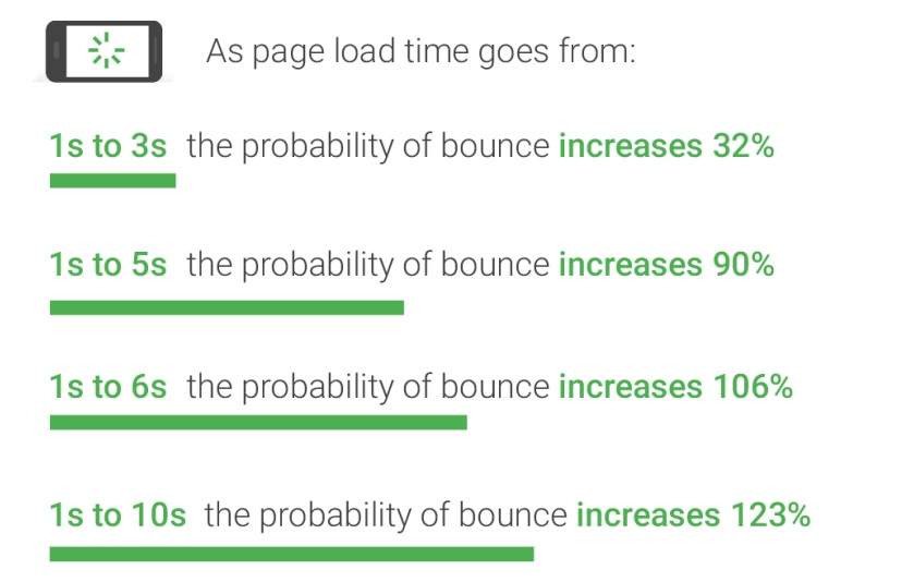
(Source: YoomWeb)
There is nothing trivial about this. The loading time has a negative impact on the way users experience the website. Let’s not forget that their goal is to access content or to perform an action in as timely a manner as possible. This factor is so crucial that even Google takes it into account when ranking pages. The search engine uses technical indicators known as Core Web Vitals that show how the elements are displayed within the page, or how quickly a user can interact with these elements, for instance. Optimizing the size of the images, the code, or the animations is an effective way to improve these factors.

Yet the technical dimension of UX Design doesn’t stop there. Another instrumental point resides in the pages’ ability to display content quickly and properly on every device. This means that a website should adapt to various screen sizes (desktop, mobile, or tablet).
Designing to Reassure
The user experience also conditions how the user feels about the website, especially with regard to trust. Because of that, credibility has its part to play in UX Design, since it has an influence on the customer journey, particularly when it comes to making a purchase or providing sensitive data.
What are the design elements that promote reassurance?
- A website with a professional look and feel
- Coherence between the website’s appearance and the brand’s reputation (or nature)
- No technical errors
- Pages dedicated to identifying the company (“about”, “contact”, “our team”, etc.)
- General conditions, terms of sale
- Client or user reviews and testimonies (social proof)
- Secure transactions (HTTPS protocol, secure payment, attractive return policy, etc.)
- Transparency (regarding the products, services, processes, etc.)
- Etc.
Emotions
This is the most difficult aspect to define – and therefore to assess. UX Design also incorporates a powerful emotional dimension, which needs to correspond to how the website is to be used. Almost every component of a website plays a part in its ability to bring out certain emotions – or not… Design, colours and images, tone (serious, light, humorous…), the brand’s “voice” (wording, vocabulary…), how the reader is addressed (using the second or third person, for example, makes a big difference in the English language…), and many more elements come into play.
In addition to this, the level of satisfaction that the user experience generates depends on how the information is delivered to the user, and therefore on the quality of the content, and on how sticking points are managed (to put the user’s mind at ease and make sure they want to follow the customer journey to the end).
That is why UX Design goes hand in hand with an in-depth understanding of your users. You need to identify well-rounded buyer personas and analyse their behaviour (through analytics) to know how Internet users think and to determine the objectives they pursue.
Why is UX Design so Important?
All these considerations around the topic of UX Design and user experience quality may seem abstract. The consequences of poor UX Design, on the other hand, are very palpable! They can…
- Affect your business’s reputation (and lessen the public’s trust in you)
- Increase your bounce rate (which, in turn, can have repercussions on your pages’ positioning in the search results)
- Penalize your SEO (for technical reasons or because of the users’ behaviour)
- Limit your website’s user retention rate (as users won’t make it to the end of the customer journey)
- Affect your conversion rate, and therefore your sales
- Impact your retention strategy.
These are just as many reasons why you should think in terms of UX Design right from the design phase (be it for a website, a mobile app, software, a product…) and place the notion of user experience at the heart of your efforts. After all, isn’t the whole point to appeal to the end user?


