Without a well-thought-out website structure, the content it contains is nothing but a string of disorderly information. That’s why a website’s architecture is so important. It plays a crucial part in the quality of the user experience all while making the crawlers’ job easier. In essence, a good website structure is a fundamental element in any digital strategy and should be developed as the website is being designed or redesigned. But it does remain a complex exercise, which requires you to ask the right questions and to think ahead in terms of your objectives and of how you want to organize your content. In this article, we’re going to find out what a website architecture is and how to build and use an SEO website structure that also matches your users’ expectations.
What Is a Website Structure, Exactly?
A website architecture is another way of referring to how you structure a website, to how its pages are organized, and the information categorized. It’s almost like a “blueprint” of the website. A lot of care must go into creating it in order to offer a quality user experience to the visitors and to allow search engine bots to crawl and index the pages correctly.
There are different approaches when it comes to structuring a website, with three main types of architectures:
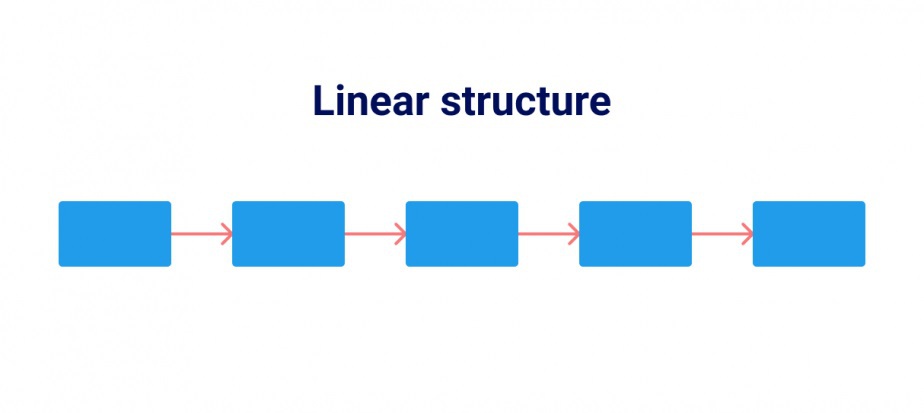
- Linear structures, where one page leads to another, providing a simplified navigation path that goes straight to the point. This category of site structure is ideal for display websites with few pages.

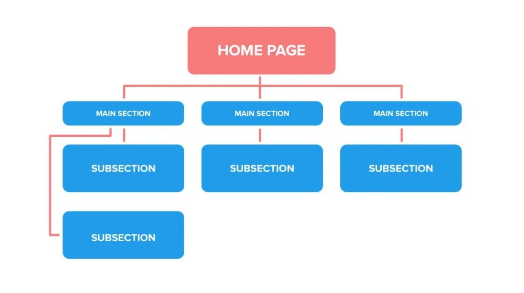
- Tree Model or Hierarchized structures. These are the most common and resemble a “tree” (with several branches) which guides the users from the more general to the more specific pages. This architecture is suitable for most websites, including those with a very large number of pages. Typically, it is divided into levels. Level 1 (home page), Level 2 (category pages), Level 3 (subcategories, topics, products, etc.). Every level corresponds to an additional degree of depth.

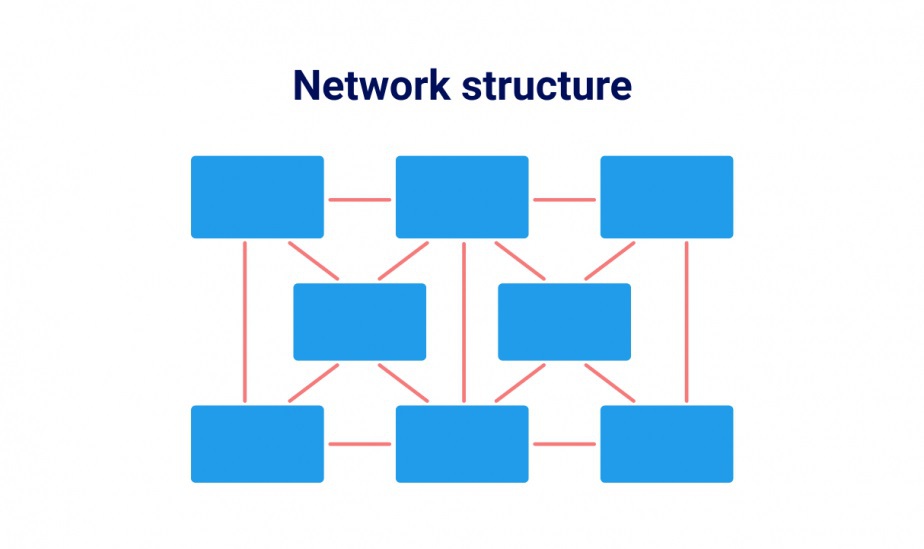
- Network structures are rarer. This type of website architecture makes it so that each web page can be accessed from any other through an optimized internal linking approach. This URL structure is only suitable for sites with a limited number of pages.

(Image source: SE Ranking)
You can work on your website’s structure at three key moments throughout its lifetime:
- When working on a plan for your website, which is to say prior to designing it. This is the best time to do it, since you’re starting from scratch, without any of the constraints that an existing structure implies.
- As the website lives and grows, for example when you decide to add categories or subcategories, or to create a blog. It’s the perfect time to reflect on the best ways to connect new pages together and to link them with the ones that are already there.
- During a website redesign, which gives you the opportunity to rethink your entire site architecture based on existing content and on what you’ve learned from your visitors’ behaviour.
Why Should you Optimize your Website’s Structure?
Designing (or redesigning) your website architecture is essential… But why is that, exactly? What benefits can actually you get from a more rational, better organized structure?
- A better user experience. A well-designed website structure is a non-negotiable if you want to create a quality UX for your users and make your site easy to navigate. The reasoning is that a user who enjoys visiting a website is likely to spend more time there, to peruse the pages, and to end up converting.
- Improved SEO. Website structures do matter in SEO, and this is nothing new. Google likes (and promotes) websites that provide a good user experience, so that’s a first step towards better search engine optimization. But it gets better! A well-structured website, with clearly organized pages, is also easier to crawl for the search engine’s bots – as they need to understand the pages’ contents in order to index them. Knowing that bots consider higher-level (1 and 2) pages more important, it makes sense to avoid developing a website architecture that’s too deep.
- Optimized navigation. A user usually has a specific goal in mind when visiting a site. They may want to access a certain page, particular information, a piece of content… The website’s structure creates a path that is designed to guide the user towards what they are interested in as directly as possible.
- The ability to display sitelinks. A sitelink is an appended organic link displayed below the website’s main URL in the SERP, giving the user more choices if they wish to access the corresponding content straight from there. For the company, this offers additional visibility and could potentially result in an improved click-through rate. But if you want to take advantage of that – you guessed it – you will need a well-designed website architecture. One that encourages Google to give you these additional links (which it does automatically).
- A way to avoid cannibalization. When a website contains many pages, addressing very similar topics is not a rare occurrence. But it can sometimes confuse search engine bots. A good website structure directs the bots’ attention to the pages that should be crawled first, and lets them know about the less important pages, too. This prevents the SEO cannibalization phenomenon.
How to Structure a Website?
Now that you have a clearer idea of why your website’s architecture is so important, you need to understand how to build a quality website structure, suitable for the needs of your company as well as the users’ and the bots’ expectations. [The following advice applies whether you are creating or redesigning a website.]
Determine your Website’s Objectives
First and foremost, you need to get clear on the reason your website should even exist – in other words, think about its mission and set its main goals. To do so, try to answer the two following questions as concisely as you can:
- Who is your website for? Identify typical users so you can come up with an architecture that matches the needs of your prospects and customers.
- How do you want your visitors to use it? Think about what users should be able to do when navigating your site. Do you want them to read content, contact you, purchase products/services, create an account, sign up for a newsletter? This will help you categorize your pages by order of importance depending on the actions users should complete.
List the Content to Be Included in your Website
Compile a list of elements you would like your website to feature. Before you even think about integrating them, consider the needs your content should address and try to cover as many probabilities as possible. You can always refine your architecture later by deleting whatever isn’t strictly necessary.
As an example, let’s imagine a neighbourhood shop wishing to design an architecture for its display site. The majority of its users will be local prospects interested in discovering the store and looking to either make a phone call or go there in person. Thus, the content should focus on:
- Introducing the shop (home page, “about” page)
- Showcasing its products or services
- Providing contact information (“contact” page)
- Legal notices (“terms”, “privacy”, etc.)
This is an oversimplified example, but it does give us an idea of the thought process to be applied in how to structure a website. Consider the information you want your prospects to have access to, then design pages that will hold that information.
In the case of a redesign, an audit of the existing site will be necessary in order to determine what the new architecture should be. Take stock of the pages that make up your current site. Sort through them (select which ones you will keep or not, which ones should stay without being included in the sitemap…), think about how you want to rank them and connect them, all while pondering new content to be created.
Finally, a great approach consists in starting from a keyword research analysis, which you can use to plan out different categories and subcategories. But be warned: You should only use keywords that are relevant to your activity. The main benefit is that the architecture thus created will support content that is likely to answer questions the users will ask, or provide information on the products/services they are looking for.
Anticipate the Visitors’ Journey
A good website structure should make navigation more straightforward. But what should the typical path look like? It is essential to define this in advance and to determine precisely what a visitor who lands on Page A through Acquisition Channel X will have to do in order to get to Content B, located on Page Y. This path will lead you to create a structure aimed at streamlining this particular scenario. Of course, you can’t imagine every single scenario. Just focus on one, two, or three personas.
Consider the different indicators you can place on a website to help users find their way and optimize their navigation:
- Sticky Menu – a menu that remains in the same place regardless of which page is being viewed or how far down the user scrolled.
- Blog Categories – for a direct access to the various topics users could be interested in.
- Breadcrumb Thread – an indicator that shows the path taken by the user and helps them see where they are on the site at any time and go back to previous pages in a single click.
- Etc.
Organize Your Website’s Architecture
With all these elements at your disposal, it’s time to design your website’s structure once and for all. Decide whether it should be linear, hierarchized, network-based, or use any other model you prefer and draw out how the different pages will connect. There are two ways to do this:
- The bottom-up approach starts from the content previously identified and aggregates the various pages, allowing the architecture to form all by itself. The risk is wanting to include content that contributes nothing to the structure itself.
- The top-down approach, on the contrary, consists in starting from a tree structure and “sticking” content that makes sense onto it. For example, you could come up with different levels of depth the further you go. The benefit is that you always have an overview of the structure created.
Whatever you choose, make sure to place your key pages as high as possible in your content hierarchy (level 1 or 2) and to keep the bots in mind. The key pages are categories, contact information, about, basket, etc.
Try and restrict the depth of your website structure to a maximum of three levels. The deeper the page, the more clicks it will take to reach it. Experts say that no page should require more than three or four clicks to get there, which guarantees an optimal user experience.
Once this preparatory work is done, you can always create a graphic representation of your website architecture, either on paper or using a dedicated software (Origami Studio, Flinto, Proto.io, Balsamiq, Cacoo…).
Connect your Pages
Once our diagram is complete, you need to think about how your pages are going to connect to one another. This applies to any architecture model you are using, even for a linear structure – though it is fundamental for a network structure. The idea is to rely on the internal linking network. In every page, you should integrate one or several links that point to one or more different pages within the same site.
The goal is to avoid creating a “cul-de-sac”, where pages don’t allow users to access other pages or go back to the previous page (except by pressing the “back” button). Ideally, your internal linking should allow users to navigate between your website’s pages and let bots go from one piece of content to the next by following a seamless string of links.
Test Your Website Structure
The last step is seeing if your website structure measures up to the reality. Take a scenario based on a specific persona and identify the path to follow in order to achieve the desired goal. Then, ask yourself three questions:
- Is the navigation simple?
- Can the user find the information they are looking for easily?
- Can the user access the content in four clicks or less?
If you find that your website architecture meets the needs of this persona… start again with a different scenario and keep testing over and over until you’re sure you have the ideal structure!
Nothing could be clearer. Your website’s structure is of the utmost importance. That’s because it conditions the quality of the user experience and allows the search engines’ crawlers to do their work more effectively. And when it comes to SEO, website structure also plays its part. But that doesn’t mean it’s an easy task and you shouldn’t hesitate to get help if you feel like you need it. Plus, a website is not a static thing. It changes over time. It evolves, it gets broader. That’s why you should challenge your architecture on a regular basis to make sure it continues to match your company’s requirements, as well as any changes in the behaviour or your users.


